Introduction
Wordmark
KIST (Korea Institute of Science and Technology)
The wordmark is a combination of the English name and initials (KIST) of the Korea Institute of Science and Technology and is designed to improve the awareness of KIST through CI and deliver an accurate image of the institution both internally and externally. Through the double meaning of 'I' and '1', the confidence of KIST was emphasized in pursuing the best and being proud of the best. It also expressed the role of a comprehensive research institute that respects individuality and creativity in each field or individual by avoiding the linear arrangement of initials and harmonizing them and creates a new scientific culture by harmonizing (converging) these various entities with each other. Moreover, RED COLOR, the main color, contains KIST's dynamic, challenging, progressive, and leading image of choosing and focusing on future sources and convergence technology and playing a central role in developing national science and technology.
Logotype
The logotype was developed in Korean, Chinese, and English in consideration of the unity and combination of the wordmark to convey the image of KIST through the name.
-
Korean logotype

-
Korean-English combination

-
Chinese logotype

-
Chinese-English combination

-
English logotype

Emblem
KIST's emblem combines the wordmark and Korean-English logotype, symbolizing authority and tradition, and can be utilized appropriately in various media.
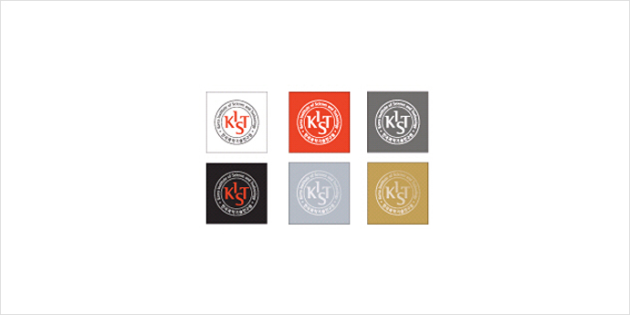
Gold and silver can also be expressed according to the color usage shown below based on the basic two colors.
-
Emblem
-
Color usage
Signature
Signature refers to a combination of the wordmark and logotypes, vital elements of CI, up and down, left and right under a certain standard.
You can select and use the appropriate one depending on the layout or situation of the applied media. In addition to the designated color, gold and silver can be used. Still, in principle, the illustrated situation should be used and expanded, and reduced in direct proportion.
-
Left-right combination of Hangul

-
Up-down combination of Hangul

-
Left-right combination of Chinese

-
Up-down combination of Chinese

Main color
Main Color
The main color is applied to the wordmark, logotypes, and various media to form KIST's unique color and deliver a consistent image. KIST Red, the main color, symbolizes the pinnacle of cutting-edge science, contains the dynamic, challenging, progressive, and leading image of KIST, and represents young ambition and passion.
The main color is used in application items as a basis, and gold and silver can be utilized as an appropriate expression technique when expressing luxury.
It is used in applications based on the main color and requires appropriate regulation. It is practical to use in promotional products (events) or promotional items.
-
KIST RED Pantone : 1788C 2X
Process Color : Cyan 5% Magenta 90% Yellow 100%
RGB : R228 G65 B38 -
KIST DARK GRAY Pantone : 425C
Process Color : Magenta 5% Yellow 10% Black 70%
RGB : R109 G110 B103
-
KIST GRAY Pantone : 423C
Process Color : Black 40%
RGB : R171 G173 B176 -
KIST SILVER Pantone : 877C
-
KIST GOLD Pantone : 873C
-
KIST YELLOW Pantone : 173C
Process Color : Magenta 35% Yellow 100%
RGB : R255 G16 -
KIST GREEN Pantone : 376C
Process Color : Cyan 50% Yellow 100%
RGB : R140 G200 B70
Color usage
The main color is applied to the wordmark, logotypes, and various media to form KIST's unique color and deliver a consistent image.
KIST Red, the main color, symbolizes the pinnacle of cutting-edge science, contains the dynamic, challenging, progressive, and leading image of KIST, and represents young ambition and passion.
-
In the case of a white background

-
In the case of a red background

-
In the case of a dark gray background

-
In the case of a black background

CI history
-
1966
-

1967~1980
-

1981~1989
-
1989 - May 21, 2003
-

May 22, 2003 - present

